Today, a business card is an interesting and useful symbiosis of advertising, an effective way of psychologically influencing a person, and fine art.
In modern society, advertising is one of the few industries that allows you to introduce people to beauty and make money from it. Therefore, the main task of a professional designer is not just to create aesthetically attractive business cards, but also to make them an effective marketing tool that brings considerable profit to the customer.
The world of advertising information is literally oversaturated with various slogans, appeals, requests and advice. Therefore, it is quite difficult for a start-up company to stand out qualitatively in this abundance. This goal can only be achieved with the help of inventive, competent and clearly thought-out work of designers, marketers and advertising specialists.
Only an experienced and qualified designer is able to create a unique business card layout, taking into account all the requirements and wishes of the customer, and the psychological mood of the future target audience. It has been proven that it is the design of a business card that is primarily appreciated and remembered by the consumer. It is logical that it is in the customer’s interests to do everything possible to ensure that the first impression of his company or services is positive. In addition, the arsenal of modern technological and graphic capabilities is almost limitless. Therefore, designers have everything they need for high-quality and productive work. Therefore, before ordering business card printing, you should definitely consult with professionals about the color scheme and the general design of your business card.
Translucency
Futuristic design and stylish look are the main qualities of translucent business cards. This design looks unusual and professional. The trend of using transparent materials for design is a new look at the look of cards. Most business cards look the same, while their transparent counterparts will take center stage.
You can present your business card fully or partially transparent, depending on your design preferences. The main thing is to make the inscription and logo distinguishable against such an unusual background. To do this, you can use a combination of transparency and texture in different parts of the card.
Where should you place your initials?
The owner's name should stand out from other data. According to Feng Shui, in order to avoid interference when moving up the career ladder and at the same time not to perform an excessive amount of work, your last name and initials on the business card should be placed like this:
- above the company name or at the same level as it;
- slightly shifted to the right relative to the center of the card;
- letters of the same size as the name of the institution or larger;
- the font of the name should be easy to read, the letters should look stable, standing freely, so as not to create the impression that they are squeezed or constrained;
- Sharp corners (“poisonous arrows”) of the logo, which harm the Chi energy, should not be directed at the initials.
According to Feng Shui, the name is not enclosed in a circle or oval. On a card printed in a foreign language, the patronymic name is not indicated. Under the name there should be information about your position or social status.
Personal business cards (not tied to a company) can be designed in either a spectacular or a strict style, but the information in them is always concise. Recommendations that will bring you prosperity: place your first and last name in the very center of the card, type of activity and contact phone number below them.
Gradient on a dark background
One of the hottest business card design trends to see in 2022 will be dark cards with a multi-colored gradient. Imagine bright colors shimmering against a dark background. They seem to flow up and down, creating an atmosphere reminiscent of waves of light.
Using this design solution, you can easily delight clients and colleagues. Such business cards seem limitless, continuous. One color smoothly flows into another, creating a smooth gradient of dozens of shades.
Bright Edges
Edges have almost never been used in business card designs. But in 2022, painted edges have finally come into fashion. This unusual design gives the business card a unique look and creates a unique visual element compared to traditional options.
Painted edges will stand out from a stack of other standard business cards and will resonate with your audience. To enhance the 3D effect, choose bright border colors and a dark card background.
Where is the logo placed according to feng shui?
The examination of documents begins in the upper left corner, so the company symbol is placed there. The best logo option is rounded elements, letters depicted without tilting, not pressing on each other, and a background symbolizing stability and security. The negative impact of sharp elements of the logo is eliminated by enclosing it with a circle or ellipse, otherwise it can provoke a wary attitude from customers.
If local representatives of a large company want to present 2 logos on a business card - theirs and the main one, the data is placed like this:
We have selected interesting articles for you:
How to choose furniture for the manager's office
30.06.2021
Arranging your desk according to Feng Shui
26.01.2019
- in the upper left corner - the logo of the main company;
- below it is the logo of the branch or subsidiary.
It is important to design the business card so that all the colors of the company logo are reflected on the business card.
QR codes
QR codes have become a modern reality and are used in almost all areas. They are nothing new, but they are now a business card trend that you will see a lot in 2021. Using QR codes makes it much easier to navigate to a company's website and social media.
To draw attention to the QR code, you can make it not just a black square, but use some design tricks:
- Depict it in the form of some thematic image: a cup of coffee for a coffee shop, a heart for a charity organization, etc.,
- Add a company logo to the QR code,
- Supplement the code with accompanying text about where you will go and what information you will receive from the link that opens.
Thus, your business card will not only tell you basic information about the company, but will also give you access to other useful information resources.
Business card color
During my work, I have seen business cards in a variety of colors and shades, single-sided and double-sided, laminated and non-laminated, made of plywood, metal and paper.
Of course, for a business person, the appearance of a business card is very important, so you should take its design very seriously. In this article we will talk about choosing the color of a business card.
What color of business card should you choose to make the right impression on your counterpart? Marketers believe that the color of a business card can tell a lot about a company, product or person, and can persuade them to make a transaction or order a service. But it can also alienate and ruin your reputation.
Indeed, colors and shades can influence a person’s consciousness in different ways, even if this is not noticeable from the outside. Therefore, you need to be extremely careful when choosing the color scheme for your business card.
According to the teachings of Feng Shui, choosing the right color for a business card can help your business prosper.
Black color in business card design
According to some experts in the field of color psychology, black is the color of uncertainty, which symbolizes a gloomy perception of life, a tendency to depression, and an aggressive rejection of the world.
Black color is often chosen by creative people who want to show their originality and even mystery. But this color is not at all suitable for designing a business card.
However, black business cards are quite common. Here are some examples (click on the image to enlarge).
Red color in business card design
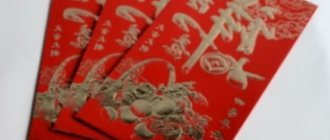
Element – fire. Red color symbolizes energy, passion, eroticism, beauty, fullness of life, joy, excitement, materialism. But if there is too much of it, a negative reaction may occur.
Suitable for representing active, loud areas of activity associated with a large burst of energy:
- electricity
- optics
- photo
- oil, coal, chemical industry
- fashion
- cooking
- Show Business
- television and radio
- Internet
- marketing
- organization of holidays
Green color in business card design
Element – tree. Symbolizes calm, peace and freshness. This color is completely neutral in perception, pleasant to both the soul and the eyes.
This color will organically fit into the design of advertising and representative products in the following areas of activity:
- design
- art
- culture
- education
- textile industry
- creation
- ecology
- crop production
Silver, white and gray colors in business card design
Element – metal. White color is universal, it means light, purity, spotlessness, freshness, solemnity, truth. On white everything is visible clearly and clearly; nothing can be hidden.
White color is ideal for contrasts: on a white background, black, dark blue, dark green, burgundy and other colors look stylish and emphasize the status of the owner of the business card. Therefore, white paper is chosen for traditional business cards.
In Germany and Great Britain, it is customary to print business cards on yellowish paper, which is made from waste paper. This is how business people in these countries demonstrate respect for nature.
Business cards with a white background are suitable for any field of activity.
A business card in cool gray and silver tones is suitable for such areas of business as:
- finance
- metal processing
- production, repair and maintenance of automobiles
- sale and production of equipment, electrical appliances
- areas of activity related to natural science and safety
This color can be advantageously combined with other colors and their shades.
Blue and dark blue colors in business card design
Element – water. Strictness, organization, inflexibility, self-control. Business cards of this color are more trusted, because blue is often chosen by business and professional people.
The choice of blue and blue colors is good for the following areas of activity:
- information Technology
- internet communications
- media (Internet, newspapers, magazines)
- trade
- production and sale of drinks
- publishing business
- journalism
- medicine
- tourism
- services sector
- theater and acting
- trade in water equipment
- water activities and attractions
Brown, yellow and orange colors in business card design
Element – earth. They symbolize positivity, positivity, calm, stimulation, self-affirmation, warmth, joy. They encourage you to take action. Business cards of these colors have a very positive effect on clients. They are well remembered and evoke only positive emotions.
The choice of brown, yellow and orange colors is good for the following areas of activity:
- real estate
- construction
- trade
- livestock farming
- processing and distribution of documentation (notary office, human resources department)
- management
Purple color in business card design
Symbolizes brightness, originality and efficiency. This color is rarely used, because few people know that this particular color inspires trust.
Don't be afraid to stand out! Choose purple for your business cards.
Don't forget, color is your assistant. Use it correctly, and then success will be guaranteed to you. Whatever color you choose for your business card, remember what it is intended for in the first place.
When you hand a person your business card, he should be able to write down the location, date, and other circumstances of the meeting on the back of it. Agree, in business circles meetings take place every day, and after some time your interlocutor may simply forget who you are.
But what if the business card is red, blue, black, metal, laminated or double-sided? You won't be able to write anything on it. So no matter what color you choose for your business card, make the back white, cream, light gray and do not laminate it.
In the following articles we will continue to talk about the features of business cards. Do not miss.
Unusual cutouts
You probably have dozens of business cards from potential clients, other companies, partners and service providers. And they all probably have the same rectangular shape. Do you want to stand out and make an original business card? Then this trend is for you.
The unusual shape will allow clients and partners to quickly find your card among other business cards. You can change the outline of the card by adding different cutouts inside or along the edges. Also, one of the parts can have a functional benefit: for example, it makes it easier to pull a business card out of a wallet.
Brown and yellow
Element – earth. These business card colors are suitable for specialists in real estate, trade, construction and livestock farming, as well as for those whose work involves the processing and distribution of documentation.
Similar articles
- Business cards for computer help (computer repair) - examples and prices
- Dental business cards. How to make a business card for a dentist
- Business cards for an electrician - samples and rules
- Business cards for car wash, tire service and car service - samples and rules
- Business cards for funeral services - samples and rules
Our partners
Recycled cardboard
In 2022, recycled materials are used in more than just bags and notepads. Now business cards printed on such paper are gaining popularity. They bring not only environmental benefits, but also the opportunity to establish emotional contact with the audience.
Every year companies pay more and more attention to the environment. Therefore, using business cards made from recycled cardboard sends a message to your audience that you care about nature and are engaged in positive activities.
If you choose business cards made from recycled paper, we recommend that you adhere to the following design criteria:
- Don't paint the background of the card; the texture and color of recycled cardboard will be more effective at attracting your audience's attention.
- Apply the inscription with soft colors (preferably natural).
- Do not use gloss or foil stamping, because the business card should be associated with nature.
Rule three. Standard size
A standard business card has a classic rectangular shape and dimensions of 90×50 or 85×55 millimeters. Such business cards fit perfectly into business holders and folders for business cards, and fit into the pockets of a wallet.
A non-standard size and shape is a great way to stand out among hundreds of identical cardboard rectangles, a good option for advertising business cards. But your potential partner cannot always put such a business card in a standard wallet or holder: it will constantly lie, at best, among the papers on his desk and, someday, will definitely get lost.
If you really want it, order it. However, it is important to remember that cutting out custom shapes is expensive, as the printer will have to order special equipment for your octagonal business cards with a triangular hole. Accordingly, their cost will be much more expensive.
Text in capital letters
Another trend this year is business cards that focus on large text. In this design option, the inscription is the main design element.
Business cards of this type contain text, which occupies the main place on them. This approach allows you to post as much information about the company as possible. Attention is paid only to the inscriptions, not to the images.
Non-standard text layout
Experimental text in design is reaching new heights and is one of the biggest trends this year. Forget about traditional left-to-right alignment and discover completely new possibilities in the context of your business card.
When choosing a business card with non-standard text, make sure that the inscription is readable. This trend will certainly attract attention: however, the main function of the card must be preserved - transmitting information.
Light blue, blue, black
Element – water. The choice of these colors is good for areas of activity related to information and technology. Here are Internet communications, publishing business, and journalism. For tourism, the service sector, theater, as well as activities related to the sale of water equipment, water activities and attractions, these colors are also perfect. Just imagine how impressive black business cards with white text and a sky blue wave image would look for a swimming pool and hot tub company.
Geometric patterns
Geometric design in business cards will be very popular in 2021. This design technique features precise and intricate patterns that look modern and thoughtful. The geometry in business cards makes it feel like the design was created by a super smart artificial intelligence program. Apply this direction in your design too.
Conclusion
Business cards are an integral part of a modern company. And an original and memorable business card is already one of the elements of brand promotion. To ensure that your product attracts attention and evokes emotions of delight, apply modern trends in creating your design. Choose one or several, combine and complement - and you will create a high-quality and attractive business card.
Ilya Lavrov
Product and graphic designer with over 10 years of experience. I write about branding, logo design and business.
Elemental symbols for business cards
- Water (liquids): curved, wavy or arched lines (representing a wave or liquid); turtle, dragon and fish
- Fire: flame, phoenix, triangle, horse and rooster
- Metal: shield, disc, stone, gold bar and coin.
- Wood: lotus flower, trees, bamboo, tall cylindrical shapes and columns.
- Earth: oval, circle, ceramic and crystal.
There are other symbols used in industry that relate to the five elements, such as: a faucet with a drop of water, a welding torch, a lumberjack cutting wood, a bulldozer moving an earthen mound, and so on.

