In order for work to be productive and efficient, and for employees to feel comfortable in the workplace, it is important to choose the right color for the office walls. In this article we will look at how to customize your office using color combinations.
Impact on humans
The color palette is important for a person, his psychological and physical state. Colors can inspire, excite, heal, or vice versa, they can depress, oppress and cause despondency. They can affect feelings, characteristics, and the environment in the house.
All shades have their own meaning; your mood, perception of the world and ability to work can depend on them. When properly designing the interior of workplaces, it is imperative to take into account the characteristic features of shades, their impact on a person and his performance.
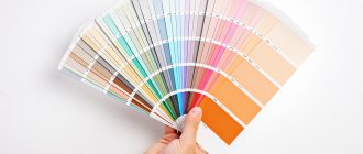
What colors to choose for the office and what to rely on?
The selection of colors for office interior decoration is influenced by several factors. Let's sort them all out.
Brand book of the company
Every second customer asks that the colors from the brand book be accurately transferred into the interior. We explain that it will not be possible to use them in their pure form, since the brand book is primarily intended for printing and website design. If you include bright shades in the interior without thinking through all the details, it will be difficult not only to work productively in the room, but also to simply stay for a long time.
During the discussion, we determine in which areas of the office it is important to use corporate colors and decide how to implement them there. We muffle, dilute, make small inclusions to create not only a beautiful, but also a comfortable space.
Our task is to “make friends” between the brand book and reality.
The most revealing project from this point of view was the office project of the management company Cosmoservice. The brand book included blue and green colors, and kindness appeared in the list of values. We had an image of a soft and delicate company, so the design team developed a concept using complex shades of green and blue, natural and calming. It seemed that this was an ideal fit, but the customer did not accept the concept, citing the fact that the interior turned out to be too “calm” for his active employees. Overall, I liked everything, but I didn’t have enough energy.
This is what the first version of the concept looked like, which was not agreed upon.
We were asked to brighten up and introduce neon blue, which was used throughout the website and printed materials. This color does not exist in nature; it can only be seen on the screen.
During the process of adjustments, it turned out that if you simply “tweaked” the blue, the concept would fall apart. One inappropriate element of bright color can ruin everything; other interior details look dirty against its background. It was the same in this case - the branded blue “crushed” the rest, so we had to change the color scheme completely.
In the second version of the concept, graphics appeared on the walls and furniture, as well as “space” chairs of unusual shape. Later, the company’s brand book changed, and we developed a third option, something between the first and second.
Features of the room
It’s easy to work in a bright, spacious office—you don’t subconsciously want to overload it with bright accents. We laid down gray carpeting, installed bright poufs, and it’s already beautiful.
A space where there is little light can be used in different ways: either painted white so that the walls do not put pressure on it, or supported with dark accents.
If the future office has different windows, different decoration, or height differences, this is a problem with an asterisk. There is a lot of work here, including with color.
There are many options. There are generally accepted rules, but they can and should be broken.
Scope of the company
There are no universal solutions. What is unacceptable for some is optimal for others.
We proposed a very bold concept to Metso&Outotec, a world leader in integrated solutions and services in the mineral processing and metallurgy industries. When decorating the company's new office, they used dark colors, sharp contrasts, and rough shapes. For some other business the solutions might have been inappropriate, but in this case they were perfect.
The dominant feature of the entrance area is the reception desk made of stone. The black color emphasizes the “brutal” character of the company, and the unusual shape is associated with ore and minerals.
Finishing materials and coatings
When developing a concept, we always order paint colors, veneer samples, carpeting, etc. The palette in which the selected materials are available can also influence the choice of office color scheme.
Snow-white work area
The tones of the white spectrum are harmonious in small rooms with a lack of natural light. They help improve efficiency, increase work speed, tone you up and set you up for optimism.
With sufficient natural light, it visually increases the space. It can be used as the main tone, or it can be used as an accent as a group of furniture against the background of other colors. A mix of white with brown, green or gray looks especially harmonious.
Red color
It is the most basic stimulating color. It is not recommended to use red in large quantities in the interior. Since this can lead to fatigue in people who are excitable and imaginary and prone to anxiety. It is also not recommended to use this color in a room where people with high blood pressure are constantly present.
But if you use the red range extremely carefully and carefully, you can achieve the completely opposite result. Precisely because the color red by its nature can give a person optimism, energy and self-confidence
According to its physiology, red is able to improve blood circulation, sexual desire, and releases adrenaline. The reverse side of red is apathy, aggression and anger.
Based on the psychology of the color red, it can be used in the interior when decorating a kitchen, hallway, staircase, gym or office.
Nude palette
Pastel beige tones are universal. They are calming, provide stability and security, and are the ideal base background for dotted decor in bright colors, which makes the design complete without overloading it.
Furniture in nude tones framed by snow-white wall panels gives the room a homely feel and comfort. A mix of nude and graphite with notes of turquoise will add style and special chic to the room.
Best Paints for the Healthcare Industry
When entering a medical facility, people want it to be clean and to feel comfortable. Medical procedures often come with minor pricks and pricks, which can be stressful, so making choices that relieve some of that stress can do wonders for the patient.
Medical institutes are painted in light colors. They avoid bright red or orange flowers. Rather, the palette is usually a combination of soft colors.
How should healthcare professionals view paint colors?
Light pink. Warm, yet nurturing and feminine, light pink is often the color of choice in women's clinics. It is widely used in medical institutions. Pink has been found to calm emotional energy and can ease feelings of anger.
Blue. The human body actually produces calming chemicals when blue light enters the eyes. It is an "airy" color reminiscent of the sky and serves as the perfect backdrop for the greenery found in any establishment.
Green. Known as chromotherapy, it is used to heal people due to its balanced healing properties. Green also promotes balance and comfort, which helps patients recover faster after surgery.
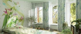
Green palette
As the main tone for decorating a study, green shades are characterized by increased productivity, neutralization of visual stress, increased creativity, enhanced creative abilities and reduced anxiety.
It gives inspiration and helps in maintaining balance and harmony. They can be harmoniously diluted with the help of dotted decor in white, wood and graphite tones. Harmonious, balanced, productivity-enhancing green tones are indispensable in the design of work areas of creative teams, at least as individual details.
Lemon shades in the decoration of work spaces
Lemon tones give an additional boost of vivacity and energy, speed up brain function, and put you in a positive mood. They need to be used carefully, because constant stimulation of the nervous system leads to overwork, and such an interior begins to depress. When choosing a shade, you should pay attention to soft, light colors, diluting them with pastels.
Such tones will be an ideal accent where you need to constantly keep yourself in good shape, where high focus and concentration are important. They can be supplemented with greenery, graphite and wood. This will dilute the tense atmosphere and allow you to distract yourself for a moment and take a breath. This is why most fast food restaurants are decorated in these colors.
Yellow
Psychologists have different opinions about the color yellow in the office. Some claim that the color yellow distracts and prevents you from focusing on important matters. Others say it improves mood and increases productivity.
View gallery
Scientists conducted an experiment and, surprisingly, both of these versions turned out to be true. This suggests that everyone’s perception of this color is at their own purely individual level. Based on this contradictory situation with the color yellow, you can proceed in two ways:
- Refuse him.
- Interview office employees, find out their opinion about painting the walls yellow and make a decision based on the data obtained.
Blue and light blue palette
A space decorated in blue tones will help increase production, improve brain function, create a trusting atmosphere, set you up for successful negotiations, and in stressful situations will help you calm down and relax. The blue tone can improve the functioning of the body after stress, evens out the pulse, reduces blood pressure and helps cope with panic attacks.
Blue spectrum tones will help increase concentration, attention and accuracy. They are able to create an atmosphere of trust and ease of communication in a team, as well as help reduce tension when disagreements arise. A relaxation room decorated in these colors will be the ideal solution.
Recommendations from psychologists
There is a whole direction in science that studies the influence of color on the human psyche. It has been proven that incorrectly selected office design can reduce employees’ performance, concentration, and brain activity. Bright colors irritate the nervous system, causing a person to quickly get tired. The combination of variegated shades causes persistent headaches. Therefore, you need to try to avoid such decisions.
Calm halftones, on the contrary, increase a person’s ability to work. They do not provoke a disruption in the processes of memorizing information or processing it, which has a positive effect on the labor process.
It has been noticed that a combination of warm and cold shades has a very beneficial effect on the human psyche. According to psychologists, this is the best choice for painting walls in commercial and office settings.
Graphite shades
The tones of the gray spectrum symbolize neatness and minimalism. They are suitable for both the main background, furniture, and spot decoration. Aristocratic restraint and majestic calmness of color convey a spirit of solving assigned tasks and focusing on completing work. They are harmonious in combinations with tones of orange, white, and green spectrums.
Modern office layout examples
The design of a workspace does not end with choosing the interior style of the room. To create a comfortable schedule in the office, it is also necessary to select and arrange the furniture correctly to ensure that it is replaced correctly. In an office space, everything should be adapted to the efficiency and effectiveness of the work process. If you enter the office too quickly, then you just need to work.
Brown work area
This palette speaks of the stability and prosperity of the owner. Brown and wood tones are timeless classics for workspaces. They promote calm and concentration on important tasks. Modern interiors combine light primary tones and expensive dark wood furniture.
Briefly about the main thing
Of course, office productivity depends on the boss and his ability to properly organize the work process. But well-chosen room design also plays a role in setting the desired rhythm. White and gray colors help create a business atmosphere, but modern managers are not afraid to experiment and keep up with the times. They listen to psychologists and hire experienced designers to improve the model to help them make money.
Source
Purple palette
The purple color palette has a stimulating effect on mental work and gives free rein to imagination. Suitable as an accent in the workplaces of creative people. The best solution would be to design an office in purple and lavender shades framed by snow-white and ash-gray flowers.
Design tips
When choosing the color design of your office, in addition to personal preferences and recommendations from psychologists, you should adhere to a few simple design rules:
- The more modest the size of the cabinet, the lighter the base color should be;
- For the south and east side, with a sufficient level of natural light, you should choose neutral or cool shades;
- Warm colors are preferred in cool or dimly lit rooms;
- Dark rooms will become cozier by using a light color palette;
- You should always select several additional ones to complement the main tone.