The sun's rays entering the house through the northern windows are refracted in the atmosphere and acquire a cold bluish tint. Such natural lighting is ideally suited for kitchen spaces, the functionality of which involves hot technological processes. But excessive coolness and shadow can deprive the interior of the necessary home warmth and comfort, so for a kitchen facing north, it will be especially important to choose the right lines and shapes, colors, and also provide an additional lighting system. How to make up for the lack of sunlight and energy, what positive and warm accents will make a kitchen on the north side softer and more comfortable - we will tell you in this article.
A color scheme
Nowhere will you find recommendations on which colors to use and which not to use in the kitchen. Consider first of all their harmonious combination. In this regard, the following principles are often used when designing:
- Contrasting. About 60% of the entire interior should be painted in the main color, allocate 30% to the complementary color, and the remaining 10% is enough to place accents. Based on the principle of contrast, a bright design is created in eye-catching shades. Saturated colors (red, orange) will successfully dilute a boring background if you make them complementary. They rarely act as the main ones.
- Connected. Involves using colors together that are close to each other on the color wheel.
- Monochrome. One color is taken as a basis, and its shades become additional. The most difficult principle to implement, since it is necessary to take into account all the characteristics of color - intensity, saturation, psychological impact. It is important not to end up with a range that merges into one spot. It is especially dangerous to use orange, red and purple shades in monochrome.
General recommendations
A lot of activity is concentrated in the kitchen, so Yang energy predominates in this room. And here it is important to achieve the right balance of energy.
Initially, this room is dominated by two opposing elements: fire and water. After all, one of the main appliances here is the stove and sink. It is important to smooth out this confrontation. Therefore, it is important to choose the right positions for these devices, choose the right color scheme, taking into account the recommendations of Feng Shui.
Color and human psychological perception
All existing shades of colors can be divided into:
- Warm, creating a friendly, positive atmosphere. They are suitable for dimly lit areas and literally radiate energy. These are red, pink, yellow, brick shades.
- Cold, having a calming, relaxing and peaceful effect on the psyche. Among them are fresh green, blue and gray colors.
Tip: Within each color you can achieve warmer or cooler shades. Dark options narrow the space and make it smaller. Light colors help visually expand the area. They can be combined with each other for different purposes.
Depending on your temperament, psychologists recommend which tones to choose for the kitchen:
- Sanguine people will feel comfortable in light green, yellow and orange colors. These are active people, prone to action and mobility.
- Cholerics will love red and orange cuisine.
- Melancholic people are better off choosing calm colors with white and blue colors, as well as classic brown.
- Phlegmatic people can be advised to abandon scarlet shades, which will depress them.
The nature of work and lifestyle also influence the choice of color. Violet colors are preferred by creative people, while nervous people will feel more comfortable in a beige space.
According to Feng Shui, warm and light colors are good for the kitchen. But you shouldn’t go overboard with red and orange, because the room already has a source of the element of fire - a stove. Bright, cold shades are not suitable for the same reason - due to the presence of a water tap. You need to choose colors that do not conflict with the elements.
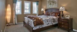
If the bedroom is on the north side
The colors of the wallpaper for the bedroom, which is located in the northern part of the house or apartment, deserve special attention. Because in this part of the house there is very little natural sunlight, and, therefore, natural heat.
So, when choosing shades of facing material for northern bedrooms, it is important to follow three basic rules.
- Choose predominantly warm shades - especially light ones, which will fill the room with light, visually expand it and add a feeling of warmth.
- It is also worth paying attention not just to light colors, but to rich, deep shades - they are perfect if the room itself is dark.
- You should not give preference to white, especially if there is little light in the room or there is only one small window.
In some cases, it is possible to wallpaper the bedroom in two colors - this way you can add light in one part of the room, visually expand it, and in another fill the room, albeit artificially, with much-needed warmth.
Style and colors
Features of interior styles suggest which color scheme to choose for the kitchen:
- Sanguine people will feel comfortable in light green, yellow and orange colors. These are active people, prone to action and mobility.
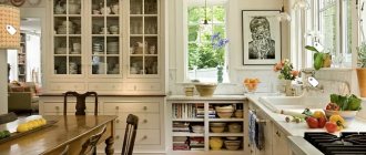
- Classic does not allow combining contrasting shades. Here it is customary to use different shades of brown. A classic wooden kitchen in natural wood tones looks expensive and luxurious.
- Loft includes shades of natural wood, brick or raw concrete.
- Provence loves muted beige shades, combined with delicate versions of bright colors.
- Neoclassicism is pastel colors and soft halftones.
- Romantic styles such as country and Provence love natural tones. It is allowed to complement the design with rich accents in small details.
- Modernism combines not only light colors, but also rich ones.
- Minimalism implies restraint in colors. The most common combination is black and white and their shades.
- Scandinavian style is made in light and calm background colors with accent details.
- High-tech is white, silver, black and gray shades. But the main feature is the presence of metal components. Bright details are present in a single copy.
Spacious kitchen interior
In the interior of a spacious kitchen, various colors of cold, warm shades and their combinations are used. If you need to visually reduce the space and make it compact, then dark burgundy, orange, dark green, and brown shades would be suitable options. But these shades must be diluted with lighter colors so that the room does not seem gloomy.
Light pastel colors with the addition of bright accents will look great in the kitchen interior.
How not to make a mistake?
When purchasing finishing materials, accessories and furniture, you will choose a shade if you listen to some tips:
- Form a project. This can be done using specialized programs that can be found on the Internet.
- Check the color compatibility according to the table. They must be in harmony with each other.
- Take as a basis a picture of the interior from the Internet that you liked. Match the colors to the real photo. Analyze whether the design will suit your layout.
The perception of the interior is influenced by the size of the kitchen, natural and artificial lighting, ceiling height and the entire design concept.
Before choosing material and furniture, think about what mood will reign in the kitchen:
- calm and easy;
- balanced;
- cheerful and bright.
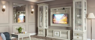
When it comes to choosing which kitchen color to choose, the most popular shades are white and gray. But there are also bright design options. It is important to design everything so that a large number of shades does not tire you. Modern design allows you to combine different colors in the upper and lower tiers of the headset.
Tip: Remember that repainting walls is easier than buying new furniture. Therefore, it is better to leave rich colors for walls. A thoughtful choice of color guarantees you a good mood and appetite.
Registration results
Using Feng Shui recommendations, you can decorate your home in the best way to ensure its well-being. At the same time, you can navigate the choice of color, which very often becomes a dilemma for many. Feng Shui helps you correlate your views, feelings, and intuitions with a valid, proven philosophy. This is the standard by which interior design can be built. It is important to take into account the energies, or rather their balance, then harmony can be achieved. In this case, you will have to take into account the location of the kitchen in relation to the entire apartment.
And in order to get additional ideas, you can look at photographs of already created premises, take into account the experience of others, then it will be easier for you to successfully implement your plans.
Choosing a color
White
Pairs perfectly with all other shades. It gives lightness, peace and freedom to the space. There is no need to be afraid of him. Modern materials allow you to quickly return it to its original whiteness. It is considered the most popular of all colors. It can be found in many styles. In Scandinavian style, it serves as the main shade, combined with natural materials. In high-tech it harmonizes with chromed metal. And in minimalist retro you can see white and red designs.
Yellow
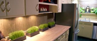
It makes up for the lack of sunlight and creates a friendly mood. Associated with energy and youth. But in large quantities it can be irritating. It is perfect with black, white, green, blue and red.
Beige
It looks stylish, especially if you dilute it with green, pink or purple. This is a proven color for kitchen furniture, resistant to changes in fashion and creating a cozy atmosphere.
Black
Dark kitchens are a “luxury” option. Black helps add elegance to a room and makes the space feel smaller. It is actively used in styles such as hi-tech, gothic, minimalism and retro. Black is an excellent option for a headset with chrome surfaces, glass and gloss. Such a kitchen will create a feeling of luxury and celebration.
Grey
Gray is the most practical of all shades. It is neutral in feel and looks beautiful with many bright colors. This color fits well into minimalism and modern design, which is based on simple transparent details.
Green
This color comes in many shades. Each of them will fit perfectly into the kitchen space. Light tones of green are suitable for rooms facing south, and bright tones will color gray northern rooms. It can be beautifully combined with white, red and brown. By playing with different options, you can increase or decrease the space where you need it. Green is considered ideal for the kitchen, as it improves appetite and lifts your mood. But it is better to avoid olive oil, as it provokes depression and anxiety. Designers recommend green options such as fresh lime, relaxing, pistachio and energetic light green. The color will fit perfectly into classic style, country, minimalism and Provence.
Red
A bold choice for the kitchen. It increases appetite and energizes, and if you dim the lighting, it becomes romantic and intimate. This is the color of warmth and love, which in excess will irritate. It is rarely used as the main color, more often for accessories and additional elements. It will visually make a small room smaller and will look perfect in large kitchens. It fits into retro, classic, Provence and other interior styles.
Blue
Marine shades have only recently begun to be used for kitchen interiors. They help curb appetite. If you are prone to being overweight and want to lose weight, then give preference to the color blue. Blue and cyan shades refresh the space; they “love” good lighting. They expand the space, but do not combine well with other colors.
Brown
The traditional version will mark constancy and stability. It dominates classic design styles. It goes well with a variety of textures and gives a feeling of closeness to nature. Forms elegant combinations with green, yellow, grey, red and its own shades. It is considered one of the oldest flowers used in kitchens. Light shades of brown harmonize with absolutely any color. Warm colors will make the interior majestic and original. Chocolate, caramel and coffee colors help digestion. Dark shades will add coziness.
Violet
A controversial color that is difficult to work with. It is best used to form accents in design. Color has a calming effect and creates an atmosphere of mystery and glamor.
Pink
Light pink is considered feminine and fresh. It evokes pleasant associations and looks beautiful both in a headset and on the walls. Pink relaxes and increases appetite.
Orange
This is an “appetizing” color that is suitable for people with small children. All its shades will fit well into the kitchen space and will evoke positive emotions. Orange is suitable for large and small kitchens. Accessories of this shade will look attractive in places where there is a lot of light.
Get a car wash for 0 rub.
Installation of equipment as a gift
Installment plan 0%
Table top free
Sale up to 70%
Test “Kitchen of your dreams”
More general useful tips
If you follow the philosophy of Feng Shui, it is worth considering the following nuances:
- All unused items should be removed: thrown away, donated, sold. If there is some thing that is used extremely rarely, it is valuable to you, then you can hide it, but away, somewhere in the farthest corner of the closet.
- Cleanliness and order should be maintained. It’s not just about clean dishes, accessories, and so on; there’s no need to fuss or quarrel in the kitchen. Disorder threatens financial problems in the family. It is believed that it entails trouble.
- Damaged items should be gotten rid of. Their use or storage is considered unacceptable.
- Foreign objects must be removed, otherwise there will be an obstacle to the flow of Qi energy.
- It is necessary to eliminate or minimize the number of open shelves and sharp corners.
- It's best to leave nothing on the countertop between cooking sessions. It must be clean and well-groomed.
- You need to combine products and items. For example, plates need to be stacked with plates, glasses with glasses, and so on.
- Water should not leak, wiring and lighting elements should be in good working order, and knives should be sharpened.
- The more working burners, the more positive energy enters the house.
Style features
When choosing furniture, color palette and accessories, it is worth considering the overall style of the room. There are several style options that are popular today:
- Modern. Such kitchens are characterized by elegance. This style is simple and involves the use of clear lines. To implement it, different versions of gray are used. Metallic-colored facades, dark floors, and smoky countertops look great. This play of shades will help achieve the desired mood.
- Scandinavian. This style will suit fans of minimalist interiors. It involves the use of laconic furniture, natural materials, and modest decorative elements. Gray color goes harmoniously with this style.
- Classical. This kitchen should be done in gray-blue tones. Granite shades will be interesting additions. Furniture can be made in such a palette. The distinctive features of this style are luxurious decorative elements, matte surfaces, and perfect lines.
- Provence. This style involves the use of natural materials. The interior often contains decorative details with rustic notes and sophisticated furniture. Wicker interior items look beautiful and harmonious. This helps create a cozy atmosphere. Light gray color will organically fit into the interior. It should be emphasized with bronze or copper decorative elements.
- Eclecticism. This style mixes different solutions. Therefore, gray color will be an excellent background. This direction combines ethnic and classic notes. The combination of antiques and modern looks no less successful. With strict adherence to harmonious proportions, you will be able to obtain original results.
Who can benefit from a bedroom in the north according to Feng Shui?
- Element Strong Metal
- Element Strong Earth
- Weak Water Element
- Element Weak Tree
First you need to know your element, its strength or weakness. This is the very beginning. Learned? Now, using specific examples, I will analyze the favorable colors in the bedroom in the north according to Feng Shui for these elements.
Let's start with the element strong metal.
What color does a bedroom in the north need for the Strong Metal Element?
The Strong Metal element needs the colors of the Water element in the bedroom - black, blue, light blue, turquoise. The color black in the bedroom is perceived as difficult, I would even say depressing. I have never advised my clients to use this color in their bedroom interior. Blue and turquoise always look stylish and elegant.
Just don’t overdo it with these colors, otherwise relationships will begin to blur, you will start to reason a lot, start delving into life situations, delving into yourself or your partner, and you may come to disappointing conclusions.
According to Feng Shui, water cannot be placed in the bedroom - fountains or aquariums. Even if the North is favorable for you and you want to strengthen it, never place water in a bedroom located in the North.
For the Strong Metal Element, a bedroom in the North in blue or turquoise tones will help you reduce your excessive inner rigidity. Will help you become more flexible. It will improve your communication skills: it will be easier for you to find compromises and negotiate with partners.
What color does a bedroom in the north need for the Strong Earth Element according to Feng Shui?
We need the colors of the Water element. This way your actions will be more aimed at making money and gaining financial freedom.
What color does a bedroom in the north need for the Weak Water Element according to Feng Shui?
You need the colors of the element Metal, these are gold, silver, gray colors - read the article “Bedroom according to Feng Shui in the West” and use these tips. You can also introduce the colors of the Water element into your bedroom interior by combining them with metallic shades. By using this combination of colors, you will not break the rules: for the Weak Water element, these colors are the best.
The Weak Water element needs to train the will, the desire to win and achieve success. The colors of the Metal element can help you with this.
What color does a bedroom in the north need for the Weak Wood Element according to Feng Shui?
These are the colors of the element Water. Your Weak Tree, saturated with water, will become stronger - you will be able to express yourself more clearly in society. You will be able to convey your thoughts or projects to managers. You will be able to find a higher circle of friends.
When placing your bedroom in the North according to Feng Shui, you need to be sure that this direction supports you.
In 2022, the North is ruled by a favorable Star, the Star of Power. This is one of the few areas of this year where it is favorable to place a bed in the bedroom according to Feng Shui. You just need to do this on the day and hour individually calculated by the Master.
If you want to do everything according to the rules, use the advice of a Feng Shui Master: A bedroom in the North according to Feng Shui has its own characteristics that you need to know how to play correctly. A Feng Shui Master will help you do this.
Alternative lighting sources
Even if all the walls are light, this will not help fill the “northern” room with light.
Therefore, in this case, you should pay special attention to the presence in the bedroom of additional sources of artificial lighting located at different levels.
This could be original ceiling lighting, which is especially relevant for interiors in a modern style, sconces above the head of the bed, floor lamps, night lamps. You can install hidden lighting near the window. This technique will allow you to create a visual illusion of the presence of natural light in the dark.
Gray scale
Today there are many variations of gray, each of which is characterized by certain characteristics.
This color helps to create a cozy interior. To do this, you should choose complements of soft and warm shades.
Silver
This shade looks truly luxurious. In order not to overload the interior, it is worth choosing laconic additions to it.
This is a deep shade. It can be combined with light or bright details.
Smoke gray
This color looks elegant and mysterious. To create a harmonious interior, it is worth choosing complements of deep shades.
Twilight
This gloomy color looks mysterious and enigmatic. To create an interior with his participation, light colors are used.
Wet asphalt
This color evokes associations with home comfort. To create a beautiful interior, you need to correctly place color accents.