It's amazing how much money business owners let slip through their fingers when they hand out their business cards, which potential clients simply throw in the trash or put in a drawer. Do you want this to not happen? You will make business cards according to Feng Shui so that they are correctly designed, attract attention, are convincing and selling.
The psychology of people is such that they always trust printed communication more than oral communication. Properly designed print communication conveys authority and professionalism. And it also allows your potential clients or partners to get an idea of how you provide your services and conduct business.
A well-designed business card based on the elements of Feng Shui is a kind of silent salesman who can attract wealth to a company and good luck to a person in his career. Read more about how to come up with a business card design for a successful business in today’s article.
Correct design of a business card according to Feng Shui
The first thing you need to start with is to determine what to write on the business card, what image or photo to place and, most importantly, in what place.
To work with the design of any space according to Feng Shui, as a rule, the theory of the “4 celestial animals” is used - Tiger, Turtle, Dragon and Phoenix. This technique is used both on the landscape of the area around the house, and in the apartment itself, and when arranging objects on the desktop, and even in the design of business cards.
A little about this theory so that you can understand in general terms what we are talking about:
Tiger - located in the west or on the left side, if you look directly at the business card, enhances feminine yin energy and is responsible for money.
The dragon is located on the right side or in the east and represents the masculine energy responsible for reputation and luck.
Turtle in the north or if we are talking about a business card, then this is the top, gives protection and support.
And in the south or at the bottom of the business card is the Phoenix, which brings lucky opportunities and attracts various types of luck according to Feng Shui.
That's it in a nutshell. I will tell you more about these 4 celestial animals in a separate article.
Here's a list of 24 words and creative advertising phrases to ease your client's fears.
- Anonymity
- Popular
- Possibility of cancellation at any time
- Certified
- Approved
- Guarantee
- For life
- We'll refund your money
- Without obligations
- No questions asked
- You don't risk anything
- No tricks
- Officially
- Confidentially
- Protected
- Verified
- Possibility of return
- Testing
- Result
- Results
- Safely
- Tests have been carried out
- You can try before you buy
- Absolute
Where to apply: payment form on the website, registration field, review block.
To create an advertisement from just a few words, you can use one of these
How to design business cards yourself
Now let's determine which symbols, images, words or images in the design of a business card according to Feng Shui will correspond to these animals.
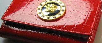
The tiger in this case is your logo, and as you see in the picture above, it should be located in the upper left corner or on the left side.
The turtle is the name of the company, at the top above the name. Because it is best to write your name after the company name on a Feng Shui business card. Or just below the name, or maybe near the central part of the business card, a little to the right, a little lower, etc. But not in the very center. Why? Read below in the section about unfavorable options for designing a business card according to Feng Shui.
The dragon can be your photograph, or a picture or symbol that reflects the essence of the business - this is the right side of the business card.
And Phoenix, located below or in the south, are your contacts.
And here it is necessary to take a reasonable approach to the balance of elements on the business card, especially if it concerns the Tiger and Dragon. Because profit and reputation are important for any company.
For example, in this case the bias will be towards money, but reputation may suffer.
Business card with “hugs of the Tiger”
But here it’s the other way around.
Strong presence of the Dragon
Another common mistake in business card design is the presence of “secret arrows” or Sha-Qi, which are aimed at the company name, logo or other important elements. Let me give you a few examples of business cards with such unfavorable character arrangements.
Logo in a dead end
The company predicts its own decline and decline
Company name and logo are under attack
The company name is under the beam and is sliding down without support.
This is the basic basic structure of designing a proper business card according to Feng Shui, and then there are criteria such as shape, size and color.
12 phrases that suggest exclusivity can help in assigning such qualities
- Exclusively for members
- To enter you need
- Full group
- Entry is currently not possible
- Request an invitation
- Try it out to become a beta member
- Exclusive offer
- Insider
- Be one of the few
- Access by subscription only
- First to receive
- Stay in touch
Where to use: login form, call to action, text subheading to attract customers.
They can finally persuade the client to buy, whet his interest or speed up the decision-making process
Business cards form
When determining the shape of business cards, as well as the color, you need to take into account the theory of the 5 elements of Feng Shui - we are talking about Earth, Water, Air, Metal and Fire. If you remember, we already did this when we independently developed a logo for a Feng Shui company.
In the article about the logo, I talked in detail about the 5 natural elements and the Cycles of Generation and Destruction, and which natural element your business belongs to, I advise you to follow the link and read. Since the entire understanding of business card design according to Feng Shui will be based on this information.
I will not repeat myself here again. Let's assume that you have already read and understand what is being discussed. So, if your business belongs to the element of Wood, then it would be a good option for you to make a vertical business card, since its symbol is a rectangle with ascending growth energy. If it is possible to do this and the design you have developed allows it, if not, then just a standard rectangular business card.
The shape of a horizontal rectangle is more related to the element of Earth, as a symbol of support and constancy. Although, of course, the symbol of the Earth is a square, you understand that there are no square or round business cards. Here we can only use some Feng Shui techniques to transform the standard template.
So for a company that belongs to the elements of Metal or Water, and has a relationship with such shapes as a circle or wave, we can use the technique of rounding corners in a rectangular business card.
What are you getting:
The advantage of the method is that you do not need to evaluate the sector itself,
we don’t look at what stars there are, whether there are SHA,
no need to select a date to run the formula.
Therefore, the method will be understandable even to beginners.
We have kept the cost of equipment to a minimum so that as much as possible
our subscribers were able to purchase it.
I know most of you need clients
and this is a good way to start attracting them.
Feng Shui colors for business cards
When choosing a color for business cards, you need to build on the theory of the 5 elements and choose it in accordance with the elements of your business. For clarity, in the article about the logo, I added a summary table of colors so that you can easily determine which color is right for your business.
There are already established color combinations for business cards, which are often used by marketers when developing their designs for various companies.
Purple and silver colors
Often in Feng Shui business card designs there is a combination of purple and silver colors to create a Yin-Yang balance.
The Chinese words for "silver" and "purple" mean wealth. This makes purple a very good choice for a business card, as it combines the elements of Water and Fire. Purple color combines the elements of Water and Fire
According to a famous Chinese proverb, the color purple comes from red being too hot. The color red is assigned to the Fire element, which rules the southern sector of fame and fortune and recognition.
Purple is also created by combining red and blue. This is important because blue represents the water element (career luck).
The powerful combination of silver and purple creates perhaps one of the most auspicious combinations, representing prosperity and good luck.
Silver is a metallic element
In the five-element production cycle, Metal forms Water. This stimulates career growth, production and improves mental abilities. This is the perfect color choice for any business card.
Red and Yellow (or Gold)
One of the most recognizable Feng Shui color combinations is red and gold.
Gold and yellow colors
Gold color is an obvious choice because, like silver, it has monetary value. The color gold is a universal symbol of wealth. As a metallic element, gold attracts the water element, which drives and determines career luck.
The sun is golden and gives energy and life to all living things. Yellow (the color of gold) represents the element Earth, and in the Cycle of Generation, Earth creates metal. The earth provides stability to the company, and the color yellow also symbolizes happiness and vitality.
Selecting red color
Red is a powerful color for any business as it signifies the Fire element. Using this color can destroy office politics, professional envy, arguments, gossip and any negative aspects within the company, making these obstacles weak and harmless. Fire (red) can melt Metal (gold) and give it any shape.
Meaning of color combination
This color combination empowers and strengthens the business, ensuring the success of business plans and their implementation. They allow you to have complete control over the direction of your business. The colors red and gold symbolize these elements and ensure business prosperity and great wealth.
The most popular headlines on Facebook and Twitter
Each social network attracts its own audience. Therefore, the content for each social network is different. Articles that are successful on Facebook will not be as read on Twitter. Conversely, content that will be in demand on Twitter will not appeal to Facebook users.
For Facebook, the types of headlines that carry emotional content will be relevant. Use the following words often:
- Shock;
- Sadly;
- I cried because...
In addition, headlines like: “What happened next was incredible”, “You don’t need to do this, otherwise ...” work well here. Such headlines attract an inquisitive audience, which is why they are popular.
For Twitter audiences, headlines that encourage readers to download something work well.
Other favorable color combinations
There are other color combinations that work well for business cards.
Black and white represent Yin and Yang. Bring harmony to your business with the symbol of Water (black) and Metal (white). The metal attracts water (wealth), which makes it attractive in color combinations.
Green and brown represent the woody element that nourishes and promotes business, providing fuel for the creative Yang element of Fire.
Brown is the color of good luck and supports the company's finances.
Yellow and brown represent the element Earth. Yellow gold is a metal produced by the Earth. Brown is also associated with darker metals such as bronze.
For other auspicious color combinations, look to the elemental elements and their corresponding colors.
How to choose a phone number for successful sales
Using numerology for business will also help increase sales.
When choosing a telephone number for a company, it is recommended to refuse those that contain the numbers 2 and 4. The most favorable are considered telephone numbers that contain 1, 3, 5, 6, 7, 8, 9. Since most often the numbers contain all or almost all numbers, you should pay attention to which of them has the largest number.
What kind of business would these color combinations suit?
Silver or Gold: Banking, finance, jewelry, medicine and surgery, government agencies, computers and technology, aviation, insurance and automobile companies.
Purple or blue: music, food, transport, cosmetics, cleaning.
Yellow: Quarry, compost and dirt supplier, real estate, environmental or agricultural industry.
Green: landscaping, furniture, wood building materials, house construction, publishing, kindergartens, education and clothing companies.
Red: Fire-related products, candles, kitchen equipment, restaurants, sports and retail.
Contrasting pictures to attract attention
Brightness alone is not enough. You have to stand out somehow: you need to be visible in the sea of content.
Your picture should have a large, bright object (ideally a person, as mentioned above) with a contrasting background. If the photo shows a man in a green T-shirt against the background of a summer forest, then it is unlikely that anyone will like the picture.
Elemental symbols for business cards
- Water (liquids): curved, wavy or arched lines (representing a wave or liquid); turtle, dragon and fish
- Fire: flame, phoenix, triangle, horse and rooster
- Metal: shield, disc, stone, gold bar and coin.
- Wood: lotus flower, trees, bamboo, tall cylindrical shapes and columns.
- Earth: oval, circle, ceramic and crystal.
There are other symbols used in industry that relate to the five elements, such as: a faucet with a drop of water, a welding torch, a lumberjack cutting wood, a bulldozer moving an earthen mound, and so on.
Which pictures attract attention first: a person needs a person
Look at glossy magazines: why do you think they feature happy, smiling women on the covers? No, it's not just because it's mostly women who buy magazines. Research (most likely by restless British scientists) has shown that all people are attracted to portraits of beautiful girls.
Photographs of men were much less successful, but pictures of things, landscapes or motifs were much less successful.
Here's an example:
When a person looks at a successful (handsome, joyful) person depicted on an advertising banner for a course, he identifies himself with him: “if I take this course, I will be just as happy.” Like that.
Conclusion
People buy from you not only because of a quality product, but because of the character and values of the business. The brand image will help convey them. Choose a logo and other images that show your company's personality, set you apart from your competitors, and create a personal connection with potential customers.
Published byNatalia Shpitula Updated August 31, 2022 Posted inBranding and logo development
Blog editor at Logaster, content marketer. Web marketing and branding expert. He knows how to write simply about complex things. Using her articles, you can build a successful brand and start successful promotion on the Internet.