When it comes to luck, people are divided into two types. Some people believe that there is no such thing as luck, everything depends on themselves. Others, on the contrary, believe in her and try to do everything to attract her into their lives.
Some people buy various talismans in the form of pendants, rings or bracelets for good luck, while others simply follow signs that predict good luck, etc.
But if you didn’t know, you can also attract good luck with the help of color. Color also has its power. It can affect our well-being, mood and, as already mentioned, our luck.
Therefore, in this article I would like to tell you exactly about these colors, adding which, for example, to your wardrobe, you can attract good luck into your life.
Green
I think you have heard that when many people see the color green, associations with nature come to mind.
Usually this is a green lawn, a tree crown or flower leaves and the like.
This color is also associated with health, fertility and restoration of strength.
This color also has a calming effect and evokes a feeling of hope for the best.
Therefore, this color has a beneficial effect on a person in situations where he experiences fear or anxiety.
Blue
Photo: pinterest
Blue is another color that can relax and set you in the right mood. It is reminiscent of the sky and sea, which signifies free spirit and adventure. This is the most common color in business, its energy evokes trust, reliability, responsibility and loyalty.
But blue is also considered conservative and predictable. Be careful with adding blue to your interior, as too much of it can bore your employees. If you don't want your business to be perceived as overly conservative, use brighter shades of blue.
Yellow
We just mentioned it, but let's look at it in more detail. Yellow symbolizes the Sun. Yellow is the color of abundance.
This color is also called optimistic, as it also symbolizes joy.
Yellow should be used in cases where you want to attract pleasant emotions, thoughts and sincere smiles. And also don’t forget to share this with others in return.
Yellow is also a great color when you have some important task or event coming up, such as an exam, business meeting, speech, etc.
How to choose a color for business
We will not go into the esoteric subtleties and symbolism of each shade. We have a specific task to choose a color for business depending on its meaning in psychology.
Black
Associated with expensive goods, quality and luxury. Especially when combined with gold.
The main target audience who chooses black is men. Accordingly, this shade is ideal for advertising:
- cars;
- hours;
- ties, shoes, suits, cufflinks;
- fountain pen.
By using black color in the design of a website or company logo, you can emphasize your superiority and attract a male audience with unobtrusive conservatism, grace, or even extravagance.
Black color in Tele2 marketing
White
The psychology of color in advertising is adjusted depending on the country. For example, in China, Japan, and India, white is a symbol of death and mourning. But we are focusing mainly on Europe and Russia. We associate this shade with openness, good health, and light.
A logo, business card, or website in white colors is perceived neutrally. This is minimalism, which does not distract from the main information that needs to be conveyed to the client.
Text material on a white background is easier and easier to perceive and assimilate. Such design encourages action and stimulates trust.
White color in Veet soap advertisement
Green
A universal color for business. Or at least harmless. The main thing is not to choose too toxic shades, like leggings from the 90s. This acidity strains the eyes, so people instinctively try to avoid looking directly at it.
Have you noticed that green logos are often found in advertisements for hospitals, pharmacies and medicines? This is because it is a natural shade that is associated with:
- with spring;
- the birth of a new life;
- health.
If your business is related to ecology, healthcare or pharmacology, using green color increases your chances of attracting customers. But green also has other properties.
Useful to read: The most complete dictionary of a copywriter
It can stimulate the appetite, which is good for restaurateurs. Also, let's not forget about the color of dollars. Therefore, wanting to emphasize the stability of the company, many rightly choose green shades for the design of offices, websites, booklets, etc.
Green color in pharmacy design
Yellow
Psychologists recommend using yellow in business when you need to focus on:
- efficiency - with a hint of yellow taxi checkers;
- friendliness, positive attitude towards the client;
- simplicity and accessibility - color affects the subconscious of the client, who decides that the product or service is quite accessible to him;
- originality - bright color creates the feeling that the company or its offer is different from others.
Yellow color in marketing
Blue
The shade is often found in offices, in particular in medical institutions. With its help it is easier to create an atmosphere of mutual trust. And this is important not only for attracting customers, but also for forming a cohesive team of employees.
Blue color awakens a feeling of confidence in the future, constancy and well-being. Therefore, according to statistics, in organizations that have a blue design, there is less turnover.
The heavenly shade is calm and safe. If you want to demonstrate the reliability of the company, use it on the website, in the office, on advertising banners, in the dress code.
Blue color in medical staff clothing
Blue
Speaking of blue, you can slightly expand the range of shades - this includes aquamarine, turquoise, cyan. These are the most trending colors in the fashion world. Therefore, they are often used in clothing stores. In addition, blue is appropriate in sports, politics, and healthcare.
In psychology, the color blue symbolizes success, so companies that have achieved tangible heights use it to indicate their stability.
As with yellow, the psychology of blue in advertising and marketing varies by geography. If the organization’s clients include Chinese, it is better to avoid this shade, because blue is their color of mourning. But if your market is Europe, your hands are free. The only problem is that blue is used too often.
Blue has become so familiar that it will be extremely difficult to stand out. If you absolutely need to focus on your own creativity, it’s probably better to use purple.
Blue color in Gucci advertising
Violet
According to psychologists, the color purple is:
- luxury;
- nobility;
- dignity.
If your business is related to creativity, a purple hue is perfect. It is also recommended to use it if the company’s products are aimed at young people. Finally, with the help of a purple tint it is possible to emphasize the originality of the product.
Useful reading: How to beat procrastination. An unusual method for freelancers
Color variations - lilac or violet - are more popular with women. That’s why you could see them more than once in advertising of women’s clothing, cosmetics, and intimate products.
When targeting a male audience, it is wiser to avoid this color. Despite modern trends in intergender communication.
Purple color in cosmetics advertising
Orange
Unlike blue, orange is rarely chosen as a corporate color. Accordingly, its originality and effectiveness increase.
Orange stands out well against other colors. It attracts attention without being annoying. In psychology, it is considered the most favorable for humans. In addition, orange tones are associated with success and health.
Conclusion: orange should be used in advertising for businesses related to:
- education;
- healthcare;
- education;
- food;
- children's goods.
Orange logo of the Detsky Mir store
Brown
A color that inspires confidence and conveys the impression of competence and hard work.
The shade is appropriate for companies that are engaged in security, protection of citizens and enterprises, organizations in the field of justice - law firms, private security companies, private lawyers.
With the help of brown color it is easy to indicate reliability and quality:
- cars;
- clothes and shoes;
- watches and other accessories.
But in the healthcare sector, it is better not to use brown. Brown, like green, being a natural color, can lead people to ambiguous associations.
Brown color on the private security company website
Pink
Concepts associated with the color pink:
- tenderness;
- romanticism;
- adventurism.
Pink is used if you need to motivate employees to take creative, unusual actions.
If you focus on clients, pink shades are appropriate in advertising women's products, wedding salons or marriage agencies. Looking at such a design, people subconsciously feel approaching happiness, joy, and the embodiment of dreams.
Bright shades of pink are actively used in business when the audience is children.
Pink color in the design of a wedding salon
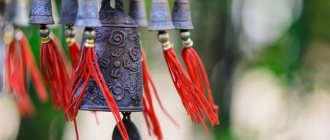
Red
The most successful color for business, marketing and advertising from a psychological point of view. Shades of red instantly attract attention. And this despite the fact that they are used by every second company.
Red encourages you to act, to do things that are unusual for a person. For example, obeying an emotional outburst, people buy something that they would not even look at in another situation. This is why color is very common in outdoor advertising and in the design of web resources that sell anything:
- from cosmetics to cars;
- from children's toys to erotic goods;
- from copywriting to skydiving.
Red color in psychology is a symbol of perseverance, fearlessness, speed and strength. Therefore, when you need to convey the idea of these concepts to the consumer, feel free to choose a red shade.
Red color in popular logos
Black
Black is another very versatile color. It can be modern or traditional, exciting or relaxing. But if you use black as a contrasting color, that is, in a ratio of 1:6, 1:8 to the main one, you risk introducing drama and sadness into the perception of visual advertising materials by your clients.
Here is an example of a landing page well thought out in terms of colors - what do you associate these colors with? — https://cashflow-igra.ru
Red
Photo: pinterest
Feng Shui defines the color red as something that will bring you luck, money and confidence. However, this is the color of anger, so it must be used extremely carefully, advises the editors of JoeInfoMedia.
Red shows love and positive thinking. It can be seen in restaurants as well as in the fashion industry. Besides all this, red is the main color in the interior of places associated with love.
The philosophy of Feng Shui be applied carefully and after becoming thoroughly familiar with the material. In this case, it will help you achieve harmony with your inner spirit and balance your energy, directing it in the right direction.
Orange
Photo: pinterest
According to Feng Shui philosophy, orange increases our concentration and has a positive effect on creativity. This color makes us think positively and fuels our vital energy. Also, orange can allow your adventurism to burst out.
Most often, orange can be found in the design of cafes, restaurants and travel agencies. Be careful when using orange in your interiors, as orange is a dominant color.
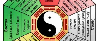
What is the color of power for Libra, Scorpio and Sagittarius?
Libra (September 23 - October 22)
Surrounded by white, pink or blue shades, Libra will be able to emphasize the sophistication of their nature. The elegance of the color will demonstrate that Libra is ready for a partnership, this will give confidence to their decisions. With blue, Libra will be able to regain their strength and balance. Shades of this color will help Libra stop doubting the correctness of their decisions. As for white and pink, they are suitable for Libra women; with these shades their feminine energy and attractiveness will be revealed.
Scorpio (October 23 - November 21)
With its burgundy color, red and black/gray, this sign will emphasize its essence as an intriguer and secret ruler. From burgundy and red, Scorpio is charged with the energy of rebirth and motivation, he transforms, he is comfortable in this energy. With black and shades of gray, the intuition of this sign awakens, and Scorpio always trusts it. For Scorpio, black is not at all negative or something scary. With this color, the sign is updated and rises to a higher level.
Sagittarius (November 22 - December 21)
For Sagittarius, the astrologer recommends choosing from purple, violet and lilac - colors for teachers and mentors. They contain the energy of life experience, wisdom and spirituality. With these rich colors, Sagittarians awaken to spirituality and strive to explore and experience. Surrounded by purple shades, Sagittarius's intellectual abilities expand, and they can decide to make significant changes in their lives.